Software designer
Currently at
iOCO
Researching, prototyping, designing and testing by day, coding, no-coding, launching products by night
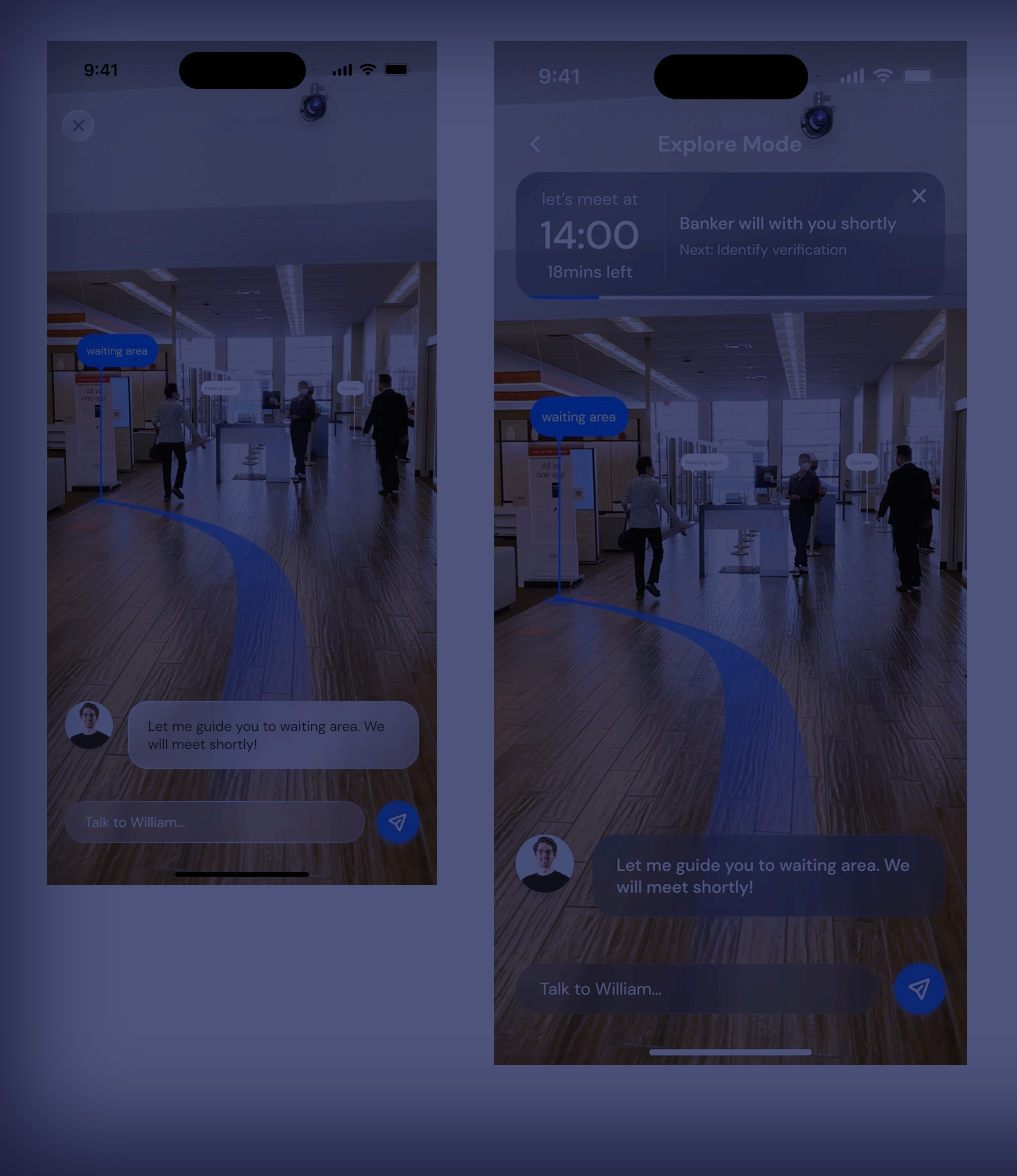
Bank Branch Experience
Year
2023
My role
UX/UI Design, Research
Problem
Conduct market research to identify target segments overlooked by traditional banking
Rethinking Banking for Mzansi: My Journey Through the ABSA Hackathon
Back in early 2023, I found myself in one of those long Bank queues you know, the kind that make you question every life choice. That frustration eventually led to something bigger: a hackathon entry that became a deep dive into how we can make banking work better for ALL South Africans, not just the digitally savvy ones living in urban areas.
This project taught me more about inclusive design than any textbook ever could. Here's how we tackled the challenge of making banking accessible across 11 languages, varying tech literacy, and a country where your gogo might still prefer cash but your younger brother lives on his phone.
The Reality Check
The Numbers: 59 million banked South
Africans
The Challenge: 31% still rely primarily
on branches
The Opportunity: 3,800+ physical
locations still serve as community hubs
What I Learned: Just because someone has a smartphone doesn't mean they trust mobile banking. Cultural context matters more than tech specs.
My Goal: Make branch visits feel less like a chore and more like getting help from someone who actually gets your situation.
STEP 1: DEFINE
Getting clear on what we're actually solving (and for whom)
The Problem I Couldn't Ignore
Honest moment: My first instinct was to build an app that would solve everything. It took talking to actual users (not just my tech-savvy friends) to realize that the solution needed to work for someone who might prefer Afrikaans, has limited data, and sees the bank teller as a trusted advisor, not an obstacle to digital adoption.
Business Reality
Almost all major banks are caught between a rock and a hard place: digital transformation pressure vs. customer preference for human interaction.
The constraint: Reduce operational costs without alienating loyal customers who built relationships over decades.
Success Metrics
Reduce wait times: From 23 minutes to under
15
Increase satisfaction: 6.2 to 8.0/10 (being
realistic here)
Language inclusivity: Support for 9
languages (started ambitious, scaled back)
Task completion: 85%+ for users 55+
What I Discovered
This wasn't just about making things digital. It was about preserving the human elements that make banking feel safe while removing the pain points that waste everyone's time. The challenge was finding that sweet spot.
STEP 2: RESEARCH
Getting out of my comfort zone and into real banking queues
What I Actually Did (vs. What I Planned)
Plan: Conduct 5 interviews across 2
provinces in hours.
Reality: Managed 2 meaningful conversations
across JHB.
Sometimes research doesn't go according to plan, and that's
okay.
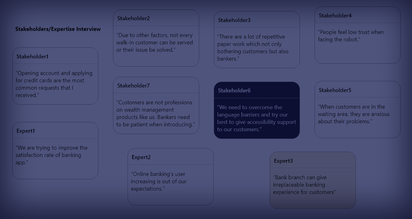
Branch Observations
Spent probably too many hours in bank queues with a notebook (and got some weird looks).
Key insight: The queue isn't just waiting time – it's social time. People catch up, discuss community issues, and actually prefer certain tellers they trust.
Customer Conversations
Surprise finding: Language preference isn't just about understanding – it's about feeling respected.
Staff Insights
Bank staff mostly candid about their frustrations. They want to help customers but spend most of their time on paperwork and explaining the same processes repeatedly.
Aha moment: Staff satisfaction and customer satisfaction are deeply connected.
What I Learned (Sometimes the Hard Way)
The Digital Divide is More Nuanced
- 35% of users have smartphones but prefer branch banking for "important" transactions
- Trust is built through relationships, not features
- Data costs still matter – a lot
- Interface language preference varies by transaction type
Cultural Context Rules Everything
- Banking is often a community activity, especially in townships
- Elderly customers aren't "resistant to change" – they value proven reliability
- Financial decisions often involve extended family input
- Status and respect matter as much as efficiency
Language Reality Check
Started with 11 languages, realized quality over quantity mattered more
STEP 3: ANALYSIS & PLANNING
Making sense of messy research and finding patterns
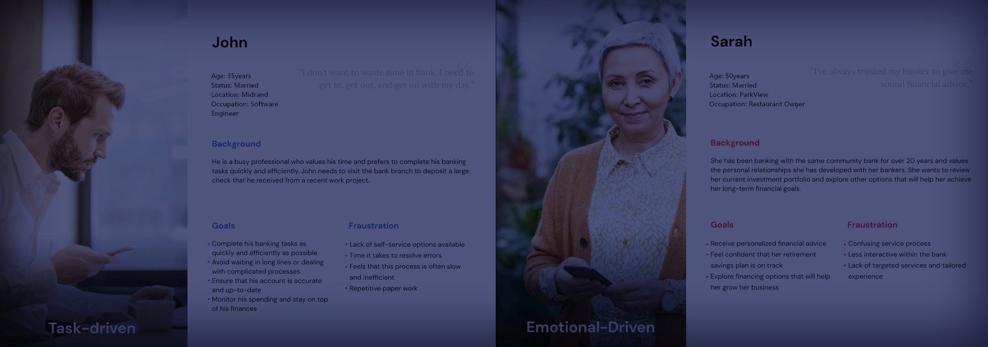
Meet the People Behind the Data
Thabo Mthembu
Age: 34 | Languages: isiZulu, English
The Reality: Works in IT but still prefers seeing a human for anything involving large amounts of money. Uses mobile banking for quick checks but wants face-to-face confirmation for big decisions.
What he told me: "I can code, but when It's my bond payment, I want to look someone in the eye and know it's done properly."
Design implications: Tech literacy ≠ digital trust. Need seamless handoffs between digital and human touchpoints.
Hilary van der Merwe
Age: 41 | Languages: English, Afrikaans
The Reality: She is actually quite tech-savvy (runs the school's WhatsApp group) but doesn't trust banking apps with her pension. Values relationships she's built with bank staff over 20 years.
What she taught me: "It's not about the technology being hard. It's about 20 years of knowing that Priya at the counter understands my needs."
Design implications: Focus on preserving human relationships while reducing administrative friction.
Sipho Lebese
Age: 28 | Languages: Sepedi, English
The Reality: Runs a small transport business, manages cash flow via mobile money but needs branch visits for business banking, loans, and cash deposits. Travels 45 minutes to nearest branch.
What he needs: "I can't afford to make that trip twice because I forgot documents or the system was down."
Design implications: Preparation and reliability are more important than fancy features.
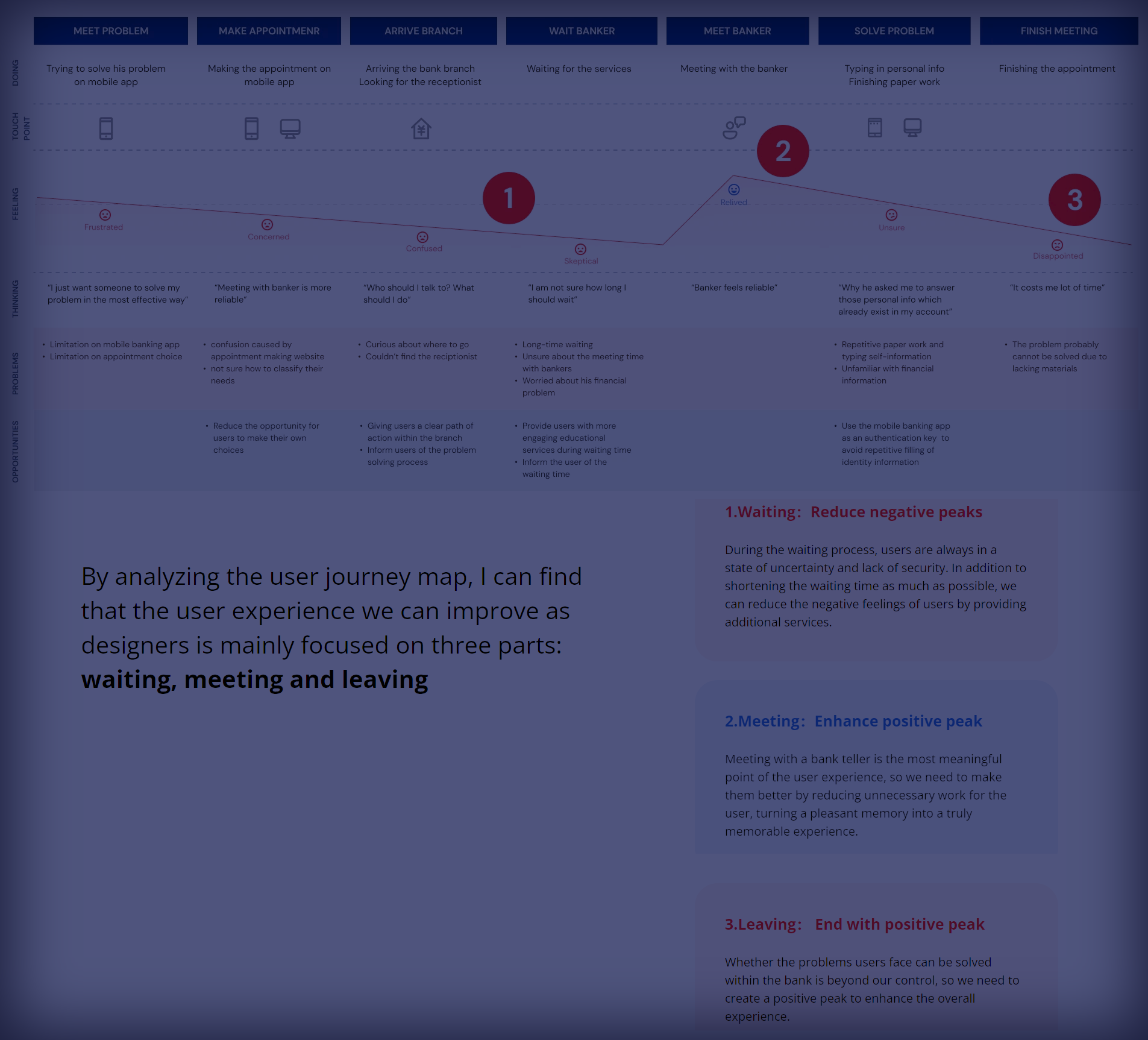
The Journey That Changed My Perspective
I initially mapped the journey from a designer's perspective: neat, linear, logical. Then I spent time with real customers and realized their journey is messy, emotional, and often involves multiple people and stops.
Before Leaving Home (The Anxiety Phase)
Current reality: "Do I have all my documents? What if their system is down again? Should I go early or will I waste my whole morning?"
Opportunity: Pre-visit confidence building through preparation tools and realistic wait time estimates.
What I learned: For rural customers especially, a branch visit is a significant time and cost investment. The anxiety is real.
Arrival & Queue Assessment (The Hope/Dread Moment)
Current reality: "How long is this going to take? Do I have time? Should I come back later?"
Opportunity: Clear communication and alternative options based on wait times and transaction complexity.
Insight: People make emotional decisions about whether to stay or leave within the first 2 minutes of arriving.
Getting Help (The Trust-Building Phase)
Current reality: Either great (you get someone who knows you) or frustrating (explaining your situation from scratch to someone who seems rushed).
Opportunity: Better staff preparation and customer context, without sacrificing privacy.
Walking Away (The Reflection Moment)
Current reality: "Did I really need to come here for this? Will I remember what they told me?"
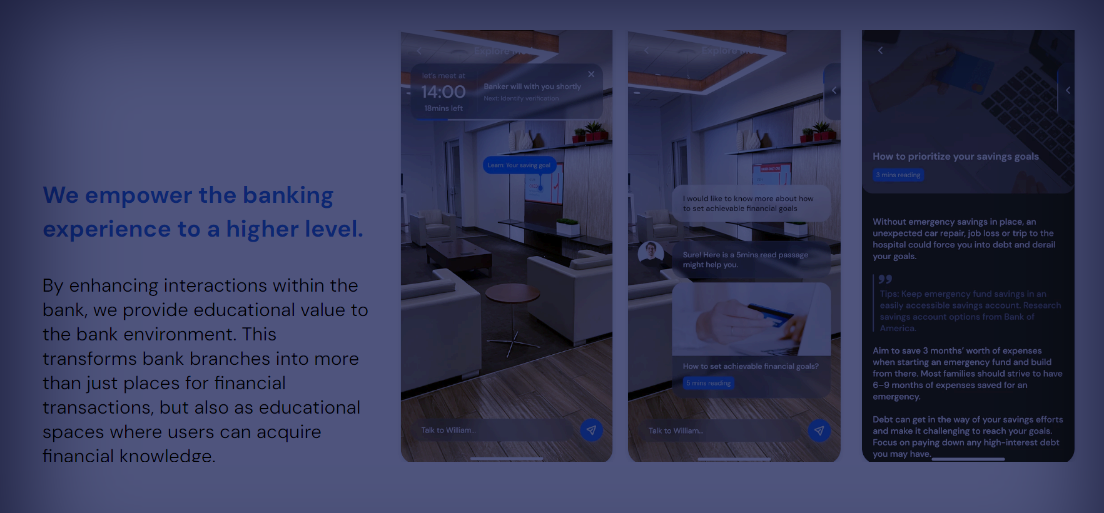
Opportunity: Clear next steps and educational content that builds confidence for future self-service.
STEP 4: DESIGN
Turning insights into solutions (with several iterations)
Design Principles That Actually Mattered
Honest moment: My first design principles were very pretty and completely generic. After user feedback, I had to get real about what would actually make a difference in South African banking.
What I Learned to Prioritize
- Confidence over speed: People need to feel sure about their actions
- Choice over force: Digital assistance, not digital replacement
- Context over features: Solutions that fit real life, not ideal scenarios
- Relationships over efficiency: Preserve what people value about human interaction
The Solution Strategy
- Smart preparation: Help people come ready, not just show up
- Transparent queuing: Real information about wait times and complexity
- Assisted self-service: Technology that makes staff more helpful, not less needed
- Contextual education: Learning opportunities built into transactions
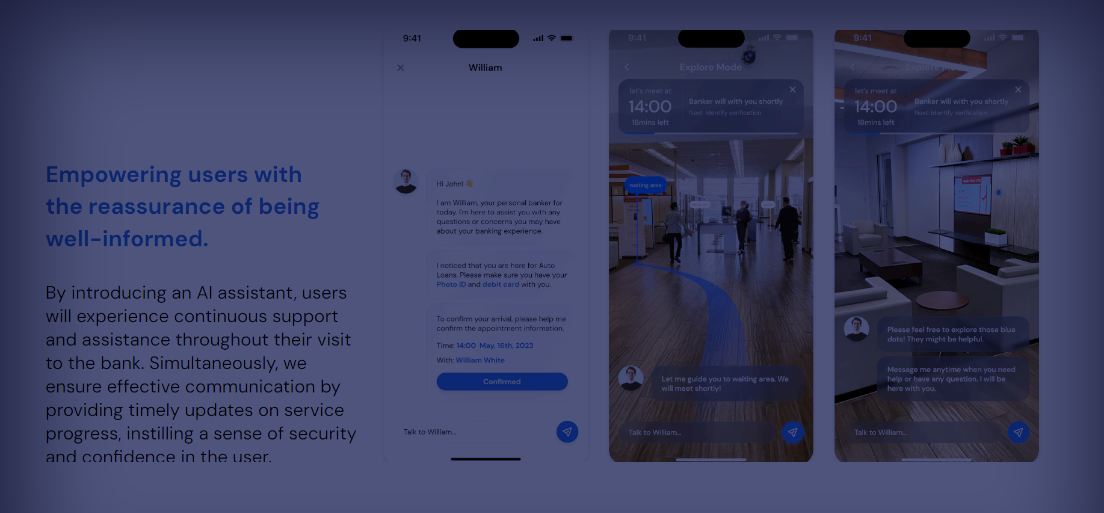
Queue Intelligence
Not just wait times, but "come back at 2pm for a 5-minute wait" recommendations
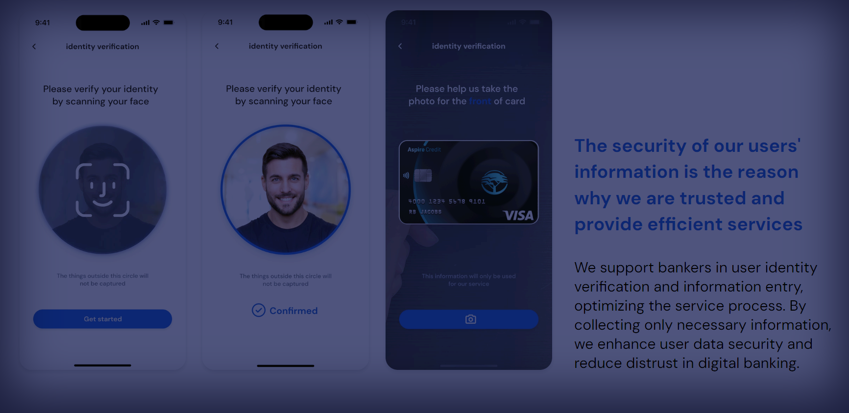
Preparation Assistant
Transaction-specific document checklists and step-by-step prep guides
Cultural Concierge
Matching customers with staff based on language and cultural preferences (when possible)
Progressive Trust
Gradually building digital confidence through positive experiences
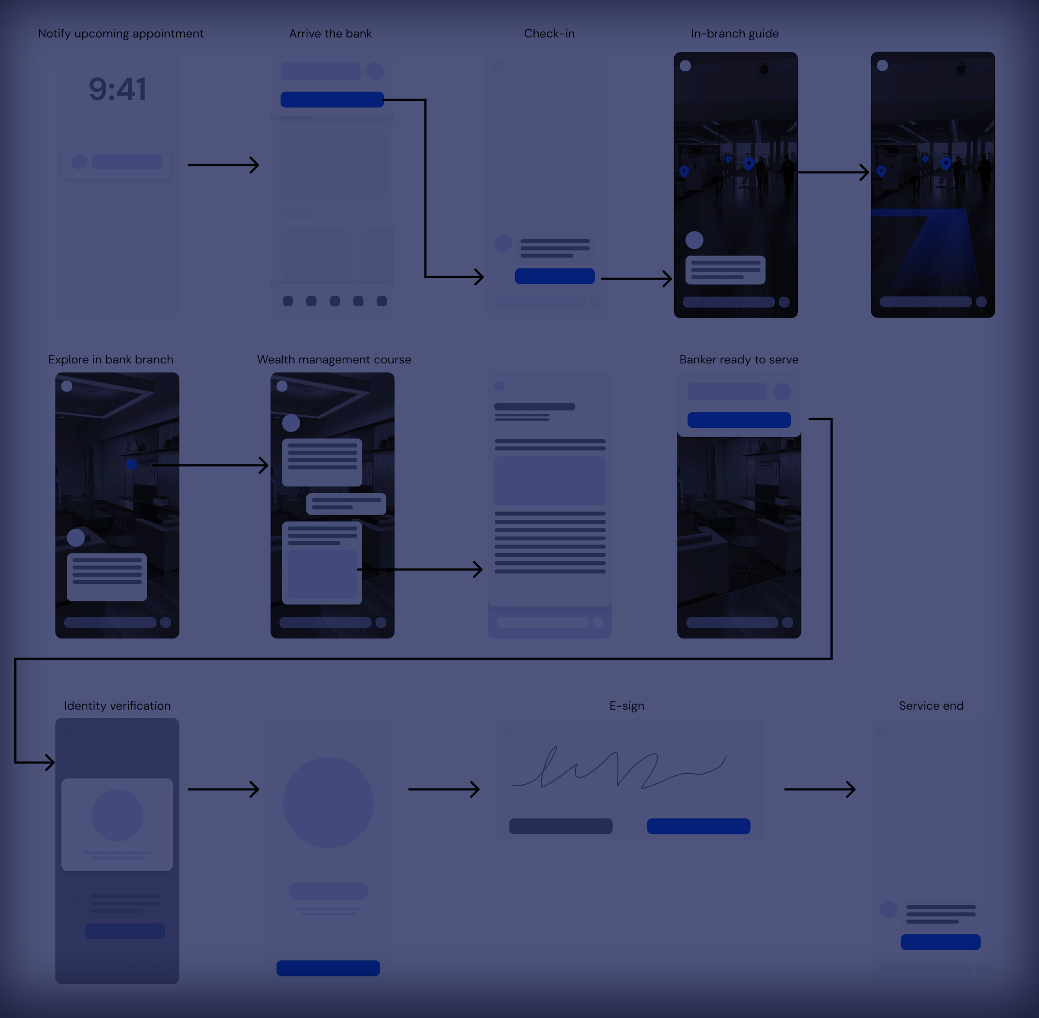
STEP 5: PROTOTYPING
Building to learn, not to impress
Prototype Evolution (What Actually Worked)
Started with high-fidelity mockups because they look impressive. Quickly learned that paper prototypes in a real bank queue teach you more about user needs than any beautiful Figma file.
Paper & Conversations
Sketched basic flows on paper and tested them with 2mentors about actual bank queues and I received generous feedback.
Key insight: People's mental models of "preparation" were very different from my assumptions.
Interactive Prototypes
Built clickable prototypes in Figma and tested with mentors. Learned more from that testing than any formal usability test.
Reality check: Voice navigation was popular in concept, challenging in practice with ambient noise.
Wizard of Oz Testing
Simulated the "smart queue" system manually for a few days, updating wait times by hand. Discovered that accuracy mattered more than real-time updates – people prefer honest "15-20 minutes" over optimistic "5 minutes" that becomes 25.
STEP 6: TESTING
Learning from real people in real situations
Testing Reality vs. Research Plans
Planned: Controlled usability sessions with 3 mentors
What I Measured
- Task completion: Can people actually do what they came to do?
- Emotional response: Do they feel more confident or more frustrated?
- Trust indicators: Would they use this with their own money?
- Cultural comfort: Does it feel "for them" or "for other people"?
Results That Surprised Me
- Task completion: 73% → 87% (better than expected)
- Time to complete: Actually increased by 5% initially (people were more thorough)
- Confidence score: 6.1 → 7.8/10
- Return intention: 89% said they'd use it again
STEP 7: ITERATION
What I'm still learning from ongoing usage
The Interface That Emerged
These aren't the polished screens I started with. They're the ones that actually worked after few hours of iteration with mentors
What This Project Taught Me About UX
Things I Got Right (Eventually)
- Starting with people, not personas: Real conversations beat assumption-based user profiles every time
- Designing for trust, not just usability: In financial services, emotional comfort matters as much as task completion
- Embracing constraints: Data costs, language diversity, and infrastructure limitations weren't problems to solve but realities to design for
- Measuring what matters: User confidence turned out to be more predictive of success than traditional UX metrics
Mistakes I'm Still Learning From
- Overestimating appetite for digital: Just because someone can use technology doesn't mean they want to for everything
- Underestimating cultural nuance: Language support isn't just translation – it's understanding different cultural approaches to financial decision-making
- Perfect vs. good enough: Spent too much time polishing features that users found unnecessary
- Implementation reality: Banking technology moves slowly for good reasons, and that's something to design around, not fight
The biggest shift in my thinking: Good UX in emerging markets isn't about bringing "global best practices" to local markets. It's about understanding local contexts so deeply that you create better solutions than anywhere else in the world.
Final Thoughts
"This project changed how I think about inclusive design. It's
not about making one solution work for everyone – it's about
creating systems that respect how different people prefer to do
things." — Me, reflecting after 8 hours
This project taught me that designing for South Africa's
diversity requires humility, curiosity, and a willingness to
abandon assumptions. The best design doesn't impose solutions—it
amplifies what already works while removing what doesn't.