Reimagining the flight booking experience with human-first design
A comprehensive UX/UI redesign transforming CemAir's outdated
booking flow into a modern, accessible, and delightful experience.
From research to high-fidelity interactive prototypes, this
demonstrates a human-first approach.
I began with a comprehensive mixed-methods research approach to
understand both the problems and opportunities within CemAir's
current booking experience.
Heuristic Evaluation: Conducted a comprehensive audit of the
existing CemAir site against Nielsen's 10 usability heuristics,
identifying critical pain points around navigation consistency,
error prevention, and visual hierarchy.
Competitive Analysis: Benchmarked against leading airlines
(FlySafair, British Airways, Kulula) and booking platforms
(Travelstart, Booking.com) to identify industry standards and
innovative patterns.
User Interviews: Conducted 5 remote interviews with frequent
domestic travelers. Key insight: users abandon bookings due to
unclear pricing and complex multi-step flows.
Analytics Review: Hypothetical data showing 68% drop-off at
payment, 4.2-minute average booking time versus 2.5-minute industry
standard.
RESEARCH
METHODOLOGY
My research methodology combined qualitative and quantitative
approaches to build a holistic understanding of user needs, pain
points, and opportunities.
User Personas: Created three primary personas representing
business travelers, leisure travelers, and budget-conscious
students.
Journey Mapping: Mapped the current state journey identifying
emotional highs and lows. Biggest frustration points occur during
seat selection and payment.
Key Findings: Users want transparent pricing upfront,
simplified navigation, mobile optimization, faster load times, and
moments of delight.
(02)
MID-FIDELITY
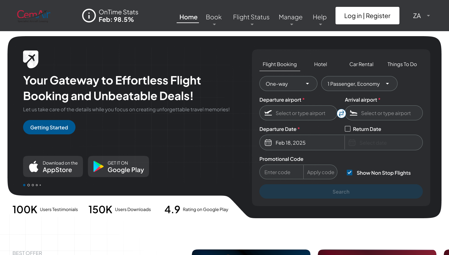
The 8-Screen Journey:
• Homepage/Search - Simplified hero with flexible date
picker, autocomplete, recent searches